Trustpilot - Rated Excellent
 Newsletter


Brand Consistency
Whether you’re online, on social media, or face-to-face at a trade show, there’s one thing that helps your business rise above the noise: brand consistency.
It’s more than just making your logo look the same everywhere — it’s about building trust, recognition, and a feeling of professionalism that sticks in people’s minds. And when it comes to print marketing, such as leaflets, brochures and exhibition stands, brand consistency becomes even more crucial. Research shows that consistent brand presentation can increase revenue by up to 23% — a powerful reminder of just how much your visual identity matters.
Let’s explore how you can make sure your brand achieves a consistent presence across print marketing materials.

What Do We Mean by Brand Consistency?
Brand consistency means keeping a unified look, tone, and message across all your marketing materials. That includes your logo, fonts, colours, imagery, and even the words you use.
It’s what helps people recognise you at a glance — whether they’re seeing your website, a business card, or your exhibition stand across the room.
Consistency makes your brand feel reliable. It tells people you’ve got things together — and that sense of trust can make all the difference when someone’s deciding who to work with or buy from.
Some common issues:
Colours don’t match between materials
Different font styles across materials
Messaging that doesn’t align with your brand voice
Elements with unaligned positioning

Why Brand Consistency is So Important
When your branding is consistent, it builds a strong identity in people’s minds. That means:
Better recognition – People remember you more easily, especially important when it comes to making a buying decision.
More trust – According to a Two Sides North America study, 76% of consumers trust coherent printed materials more than online sources when making purchasing decisions.
A more professional image – A polished, unified look sets you apart from the competition.


Why Print Marketing Needs Extra Attention
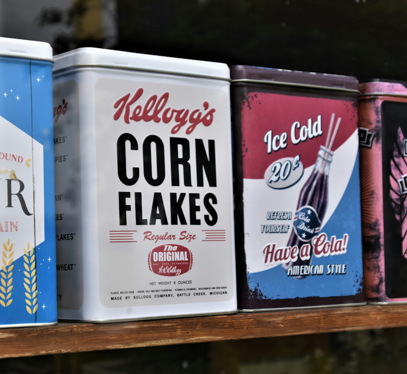
Digital content can be tweaked and updated in seconds. But print? It’s permanent. Once your materials are printed — brochures, flyers, banners, stand graphics — there’s no going back.
There is also much more potential for inconsistencies when it comes to colours – certain elements may be slightly different shades depending on the quality of print and how the marketing materials were supplied.
Unlike screens that use RGB light to display colours, printed materials rely on CMYK inks — which means colours can vary if not managed properly. Using Pantone swatches or CMYK profiles ensures that your brand colours remain consistent across every banner, brochure, or display stand.
That’s why brand consistency in print marketing is so vital. Any small mismatch in colour or quality can make your brand feel disjointed and unprofessional.


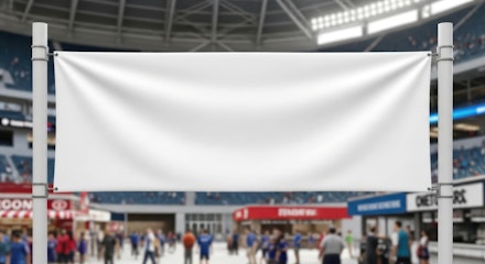
Exhibition Stands: Your Brand in the Spotlight
When it comes to print materials, there are few that are more effective than exhibition stands – the printed displays which provide the branded backdrop at event such as trade shows.
Your exhibition stand might be the first in-person experience someone has with your business. And studies have shown that an eye-catching stand is the most effective means of attracting attendees.
That’s why your stand design, graphics, and printed collateral need to be on-brand and cohesive.
It’s easy to focus only on the main exhibition stand graphic, but your brand needs to be consistent right down to your accessories such as literature holders and pop-up counters. Using the same supplier across all your exhibition stands will ensure a more cohesive brand presence.

Tips for Keeping Your Branding on Point
Here are a few practical ways to keep your branding consistent across all your print materials:
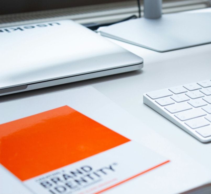
· Create clear brand guidelines – Document your fonts, colours (include Pantone/CMYK values), logo usage rules, and tone of voice. Make sure any external designers have access to these guidelines.
· Use high-quality design files – Always provide your printing company with proper assets (no blurry logos or mismatched colours). Discuss their requirements for the design file.
· Work with reliable suppliers (ideally one) – If you can limit the number of printed marketing suppliers to a single one-stop shop you reduce the likelihood of brand inconsistencies caused by different print practices.
· Review everything together – Lay out all your printed materials side by side before an event. Does it all feel cohesive? If not, tweak it.
Consistency Builds Confidence – Let Display Wizard Help
At Display Wizard, we know how much your brand matters — and we’re here to help you showcase it at its very best.
Whether you need a simple banner stand, a striking pop-up display, or a fully bespoke exhibition stand, we’re your one-stop shop for high-impact printed display marketing. With professional large-format printing and a wide range of display solutions, we make it easy to keep your branding consistent, high-quality, and event-ready.
Ready to elevate your brand presence at your next event? Get in touch to see how we can bring your brand to life.
posted in Marketing Advice
Published: | Updated:


Written By:
Noelle Kasparis
Noelle Kasparis is the eCommerce Manager at Display Wizard, a Preston based exhibition stand provider.
With over 15 years of experience in online sales, product management, and brand development, she plays a key role in expanding Display Wizard’s digital presence. Noelle is committed to ensuring the company’s products uphold the high standards of quality that customers expect while driving growth across all online channels.
Share this Event